Algorithmic Science Art: Sunplot
OK, I've been working on this one for a while. Not a while like since my last post,
more like since the pandemic.
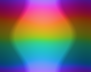
Check this beauty out:

sunplotof Boston
If you want to play around and generate your own, jump right in! If you want to learn about what it is and how I made it, read on.
What am I looking at?
You're looking at a piece of algorithmic science art called a sunplot. It illustrates the sun's position in the sky at any moment of the year. This sample, which visualizes Boston's views of the sun, is . Each of the columns represents a single day of 2026, and the pixels flow from top to bottom in -minute chunks. So at the top left we have 00:00 on January 1st, at the bottom right we have 23:55 on December 31st, and in column row you will find a pixel representing the moment at which I'm writing this paragraph.
The color of the pixel represents the location of the sun in the sky. It uses horizontal coordinates: the lightness of the pixel tells you the sun's angle from the horizon, and the hue tells you its compass direction. In the plot above, the compass is mapped to a color wheel so that red is east, yellow is south, cyan is west, and purple is north.
Development
The Spark
I have a close friend who's always been my go-to guy for collaborating on technical projects. One day in late 2020, when we were in college but not at college, he went to check when the sun was going to set. timeanddate had an answer for him, and with it a captivating plot:
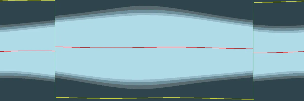
As we interpreted this chart together (over a video call), ideas flooded to us. What if, he suggested, we make a continuous version? And could it somehow also display azimuth? As the astronomy guy, he knew to ask; as the math and colors guy, I conjured an answer like a bolt of lightning.
The sun's position in the sky is a 2D quantity, and the moment of the year is a third dimension. Our output space is -dimensional, with a -dimensional grid of pixels and color channels (RGB) per pixel. Time was already wrapped to use up our spatial dimensions, leaving us only RGB to represent the sun's position. Unfortunately, red/green/blue don't map nicely to altitude and azimuth. For one thing, azimuth is a compass direction, which needs to wrap around in a circle, like... like hue! And then we needed extreme azimuths, the sun very high or low in the sky, to have less hue. This sounded exactly like HSL.
My friend coded the front end and found a good Python library to calculate the sun's position for us. I worked on the back end, especially the color calculations. But, with respect to our younger selves, the code had a lot of room for improvement.
Quality-of-life Improvements
QOL #1: Day/Night Contrast
First of all, the images came out like this:
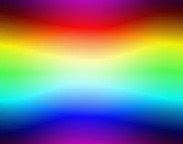 That looks cool, but it's kinda just a squiggly rainbow (and it's not even all that squiggly). It's missing the gestalt from our inspiration plot. So we added a day/night contrast adjustment, a very simple expansion algorithm. That gave us a hard edge like so:
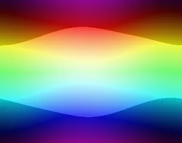
QOL #2: Daylight Saving
We added a toggle for daylight saving, so you could get a smooth image representing the flow of time or a choppy one that related the sun's position to the clock time. My friend did that part, and in my recent rewrite I didn't bother because time zones are a pain in the astronomy.
QOL #3: Customization
Don't want red to be east? We added a slider to shift the hue an arbitrary amount. We also added a toggle to switch the direction around the color wheel, in case you feel very strongly both that north is red and that west is yellow.
QOL #4: Speed?
Oy vey. The thing took 30 seconds at least to generate the image. It feels like it should be possible to go a lot faster than that. After a couple years I tried rewriting the algorithm in Rust, because Rust people (like me in 2022) make fun of Python for being slow. I couldn't get it to play nice with the front end, or with web, so I gave up.
The Rewrite
Fast forward to Spring of 2026. The sun still exists, but many things have changed. I have grown as a programmer and artist, our frontend platform (Heroku) has been acquired, the Okhsl color space has been invented, et cetera. I set out to rewrite Sunplot from the ground up, and I committed to making it zoom. I also committed not to generate any code with an LLM because that's not the fun way. Be warned, the rest of this post is technical details. If you're tapping out here, don't forget to play with the finished product! Or feel free to click around and come back.
Stack
JavaScript is the natural choice for something on the web, but its practically nonexistent typing scares me. I went with TypeScript. For dependencies, I built with Webpack. I also admitted to myself that the GPU was the right way to do things, but I did not sign up to learn a shader language. Thankfully, TypeGPU exists so that I could use WebGPU while writing more-or-less TypeScript, and as an added bonus it gave me a CPU fallback for free.
Speed!
Libraries to calculate the sun's position are generally slow. In TypeScript, they'll usually want a heavy DateTime or Temporal object. Worse, if I call the library for each pixel, a lot of calculation is repeated. I wrote the new sun calculation code from the ground up to minimize redundancy and to be GPU-friendly. Massive shout-out to Astronomy Answers for accessible formulae. Given the quantization of RGB, I estimated that I only needed to sample every minutes. The old version sampled every minute, which was frankly excessive.
Once I had sun positions worked out, calculating the colors was trivial. That all got me down to about per image using my nice-in-2021 GPU. Sadly, still more like seconds for browsers without WebGPU enabled, but I set up Web Workers to cut that down by a factor of around .
Functionality Tweaks
Coding for time zones sucks, so I made a lazy opinionated design decision: you get UTC or you get local solar time, and you're gonna like it. That means no daylight saving, which is fine by me since I never liked how it tore the images anyway.
That's the only feature I cut. In its place, I added several ways to tweak colors. The day/night contrast adjustment always felt abrupt to me, so I implemented smoothing over a user-defined range of angles near the horizon. It defaults to , i.e. above and below the horizon (because I think it looks pretty).
Next, I noticed that day and night might not deserve the same amount of adjustment. While the defaults are symmetrical, you can now set the maximum nighttime brightness1 and minimum daytime brightness independently. This way, you can let the whole night be very dark while expanding the range of colors used to represent the daytime.
In further service of utilizing the color gammut to its fullest, I added ways to raise the ceiling and lower the floor on lightness. In Boston, the sun never gets much beyond from the horizon. What a waste of colors! Now you can stretch out the color space to treat, say, as the white ceiling.
To make all these color tweaks halfway comprehensible for the user, I threw in2 an SVG that plots the relationship between azimuth and lightness. The STEM teacher in me is very happy.
Last but not least, I added more color spaces. The new default is Okhsl, which makes the plots dramatically more visually accurate. How it does this is well outside the scope of this post, but boy howdy was it in the scope of my code. Okhsl conversion to RGB is a true beast. All of the available libraries for this semi-obscure color space were not GPU friendly. I had to absolutely hack one to bits in order to make it run on the GPU, and then I practically rewrote it again to use WGSL vectors and matrices. It will never run as fast as HSL. I probably spent more time with Okhsl than I did with any other part of the project. worth it.
Conclusion/Reflection
I'm really proud of how the project turned out. It felt like my most ambitious coding yet. I learned so, so much about web dev, plus bits about SVG, astronomy, and best of all, color spaces3. Good way to stay out of the summer sun!
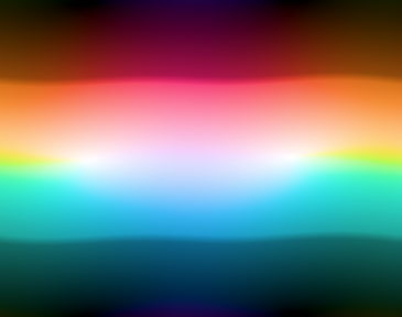
As a reward for reading this far, here are some pretty pictures (all default settings except for removing the white ceiling). In order: Boston, MA; Nanyuki, Kenya; Svalbard, Norway.

Footnotes
I'm using
brightness
as a user-facing term here, but really this is the Lightness in HSL or Okhsl, or the Value of Okhsv. I do know and care about the difference, but I don't have language that is both accurate and sufficiently accessible.↩Read: spent multiple full days of my summer debugging↩
I really like color spaces. This is not Stockholm syndrome from the days of my life I spent making Okhsl work. I love Okhsl. Pay no attention to those lines of Okhsl code behind the curtain.↩